Brand & creative
Logo & visual identity
Your logo should work on the places customers actually encounter your business, from a small app icon to packaging and presentations. I connect the mark with a consistent visual language rather than treating it as an isolated graphic.
Enquire about this service ↗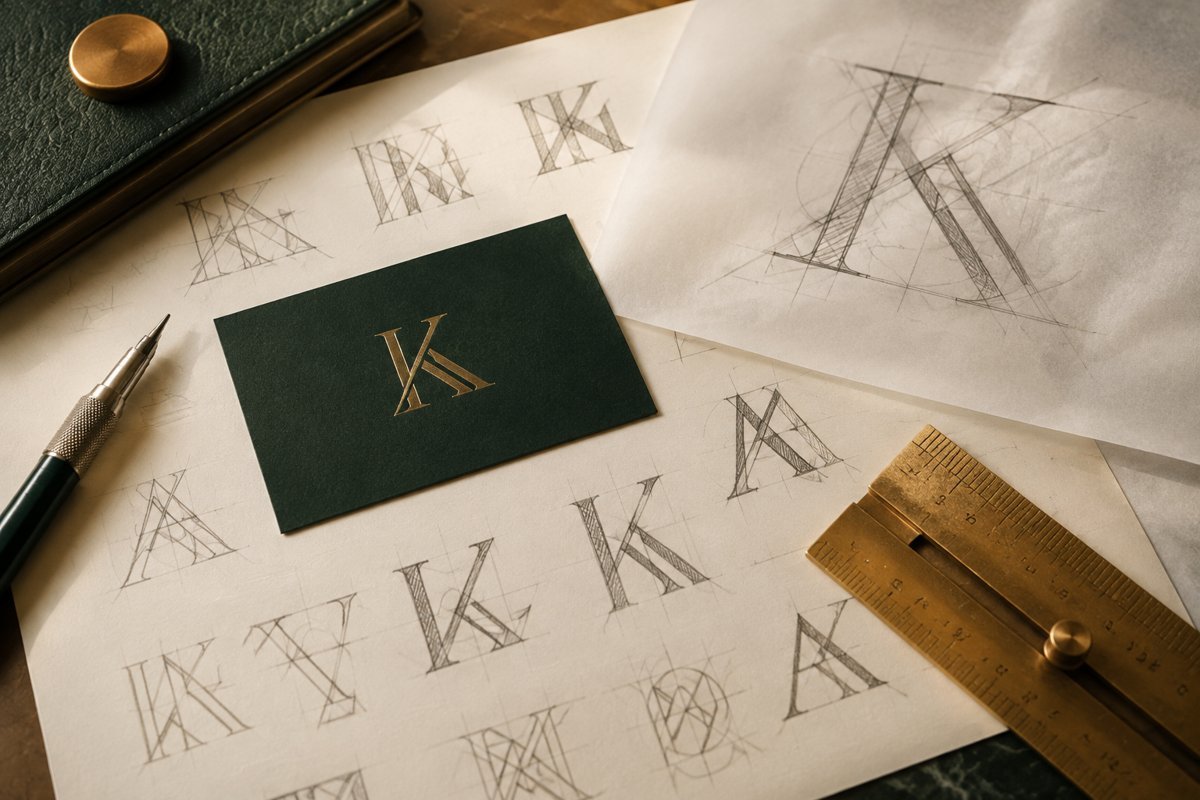
HOW I CAN HELP
A recognisable identity begins with a clear idea.
Colour and typography direction
Practical brand application guidance
THE APPROACH
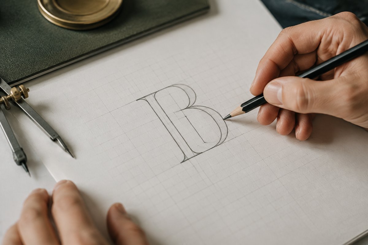
From the brief to a clear direction.
Yes. I can build the wider identity around it, including colour, typography, stationery, packaging and campaign applications. We can agree the assets you need before design begins.
Your name, audience, positioning and examples of where the logo will be used.
THE APPLICATION
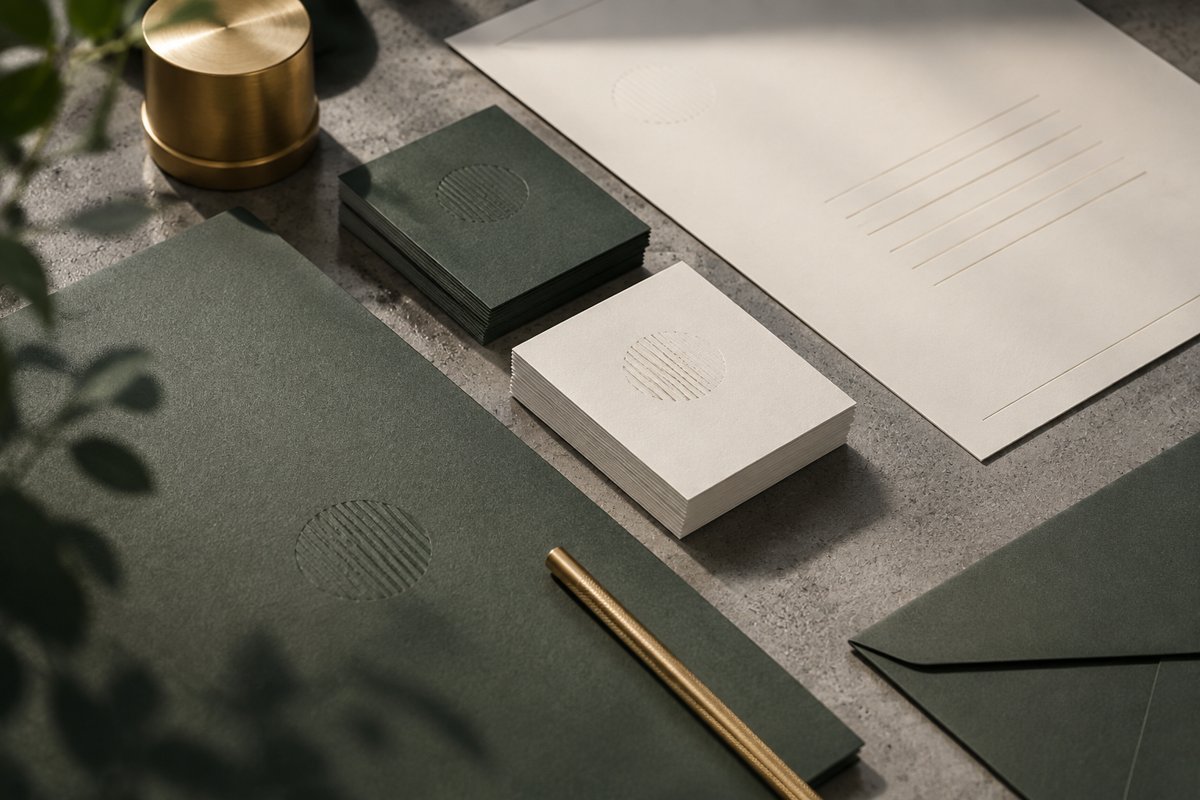
Built around the way you work.
Yes. I can assess what should be retained, improve legibility and prepare an identity that works across print, websites and social profiles.
Discuss your briefA logo is a small part of an identity, but it is the part everyone sees first and uses longest. This page explains how I approach logo and visual identity work, what you end up holding at the end, how to judge whether you need a new mark at all, and where I think businesses waste time and money.
Start with the places the logo has to live
Before I draw anything, I make a list of where the mark will appear. A favicon at sixteen pixels, a round social profile picture, an invoice header, a signboard, a product label, a slide footer, an embroidered shirt. Each of these puts different pressure on the design. A mark that looks fine on a large website banner can turn into a smudge in a browser tab.
That list shapes the brief more than any mood board does. If your logo will mostly sit inside a square app icon, a long horizontal wordmark is the wrong starting point. If you print on dark packaging, the one-colour and reversed versions matter as much as the full-colour one. I would rather settle these constraints on day one than discover them after you have approved a design.
How the design process runs
I begin with a short conversation about the business: who buys, why they choose you over alternatives, and what you want people to feel in the first few seconds. I also ask what you dislike. Negative preferences are often clearer than positive ones, and they save a round of revisions. Then I look at how others in your space present themselves, mainly to avoid looking accidentally similar.
From there I develop a small number of distinct directions rather than a large pile of variations. Each direction has a clear idea behind it, which I explain in plain words. You respond, we choose one, and I refine it: spacing, proportions, letter shapes, colour values. Refinement is where most of the quality comes from, and it is the stage people try to rush.
Review rounds are agreed upfront. Clear limits keep the project moving and keep feedback focused on the strongest direction instead of reopening every decision.
- Discovery: audience, positioning, usage list and constraints.
- Concepts: a few clearly different ideas, each with a stated rationale.
- Refinement: one chosen direction, tested at small and large sizes, in colour and in one colour.
- Identity system: colour, typography and usage rules built around the final mark.
- Handover: files in the formats your printer, developer and team will need.
What you actually receive at the end
A folder of files is the visible output, but the useful part is the guidance that travels with it. You get the primary logo and the variations you will need, such as stacked and horizontal layouts, an icon-only version, and light and dark backgrounds. You also get the colour values for screen and print, the typefaces with fallbacks for tools that cannot load them, and clear rules on clear space and minimum size.
I put this into a brand guidelines document sized to your business. A two-person studio does not need forty pages. It needs a few pages that a freelancer, a printer or a new hire can follow without calling me. If you later want the identity extended into stationery, packaging or campaign material, that is a separate scope, and I will say so before we start rather than letting it creep in.
Do you need a new logo, or a better system around the old one?
Many businesses ask for a new logo when the actual problem is inconsistency. The mark may be reasonable, but it appears in three slightly different blues, two typefaces and a stretched version on the website. In that case, a tidy-up and a clear set of rules does more for you than a redesign, and costs less. I will tell you honestly if I think that is your situation.
A new mark does make sense in some cases: the business has changed direction, the old logo cannot be reproduced cleanly, it was never designed professionally and shows it, or it is too close to another brand in your market. Moving away from a long-established mark deserves more caution. Customers who know you by sight lose a shortcut when it changes, so a careful evolution is often wiser than a clean break.
Mistakes I see again and again
The most common one is designing for taste rather than for the audience. The owner likes a particular style, but the customers who pay the bills respond to something else. A close second is too much detail: gradients, fine lines and tiny illustrated elements that disappear when the logo is shrunk or embroidered. Trends are the third problem. A mark that copies whatever is popular this year tends to look dated quickly.
There is also the matter of ownership and files. I have seen businesses unable to edit their own logo because the only copy is a flattened image sent over chat. Insist on vector source files and a written note on who owns what. Finally, avoid asking ten friends for opinions. You will get ten preferences and no direction. Choose two or three people who understand the customer.
- Choosing the logo before the positioning is clear.
- Relying on stock icons or generated marks that cannot be protected or made distinctive.
- Skipping the one-colour and small-size versions.
- Approving a design only on a laptop screen, never in a mock-up of real use.
What I need from you
Your business name as it should be written, your positioning in a sentence or two, and the audience you want to reach. Bring examples of identities you admire and ones you do not like, with a line on why. List every place the logo will be used in the next two years, even the unlikely ones. If you have an existing logo, send the best source file you can find, however poor.
I also need one decision-maker. Logo projects slow down when feedback arrives from several people who have not agreed among themselves. Agree the approval route in advance, and tell me about any legal checks, such as trademark searches, that you plan to run. I can note obvious similarities during research, but a formal trademark search is a job for a qualified professional.
How you can judge whether it worked
A logo cannot be measured the way a campaign can, and I would be wary of anyone who promises a number. Better questions are practical. Can your team use it correctly without help? Does it stay legible at small sizes? Do printed pieces, the website and social profiles now feel like the same business? Do customers recognise you faster across channels than before?
Over a longer period, consistency tends to show up indirectly, in cleaner marketing material and fewer last-minute design requests. The identity also feeds the rest of your work. The same system supports Brand strategy and positioning, Marketing creatives, Presentations and pitch decks and Packaging and labels, and a well-built identity makes each of those quicker to produce.
A good logo is the one your team can reproduce correctly, at any size, without asking anyone.
When this is not the right move
If you have not yet decided who you are selling to or what makes the offer different, a logo will not fix that. Spend the money on Brand strategy and positioning first, and design the mark afterwards. The same applies to a business that is still likely to change its name or its core offer in the next few months.
If your budget is very limited and the business is brand new, a simple, clean wordmark in a good typeface is often enough to start. It can be developed later when you know more. I would rather help you launch with something modest and correct than build an elaborate identity for a business that has not yet found its customers.
WAYS TO WORK TOGETHER
A focused project. Or ongoing support.
Start with a strategy session. We can then agree a project brief, a focused consultation or an ongoing engagement around your priorities.
YOUR QUESTIONS, ANSWERED
Logo & visual identity FAQs
Scope, preparation and what happens next.
Can you help beyond the logo?
Yes. I can build the wider identity around it, including colour, typography, stationery, packaging and campaign applications. We can agree the assets you need before design begins.
Can you refresh my existing logo?
Yes. I can assess what should be retained, improve legibility and prepare an identity that works across print, websites and social profiles.
What should I prepare for our first conversation?
Your name, audience, positioning and examples of where the logo will be used.
How are the scope and timeline agreed?
I review your requirements, starting material and target date before proposing milestones. For logo & visual identity, the schedule depends on complexity, review rounds and the access or assets needed.
How much does this service cost?
Start with a strategy session at ₹2,999 + GST. A digital audit starts from ₹19,999 + GST, and ongoing monthly options start at ₹50,000 + GST for SEO consulting or ₹75,000 + GST for a consulting retainer. Project delivery is scoped and quoted separately; we can choose the right arrangement for your brief.