Brand & creative
Presentations & pitch decks
A presentation should guide someone through an idea, not bury it in slides. I help organise the story and design a deck that supports the way you pitch, sell or introduce the business.
Enquire about this service ↗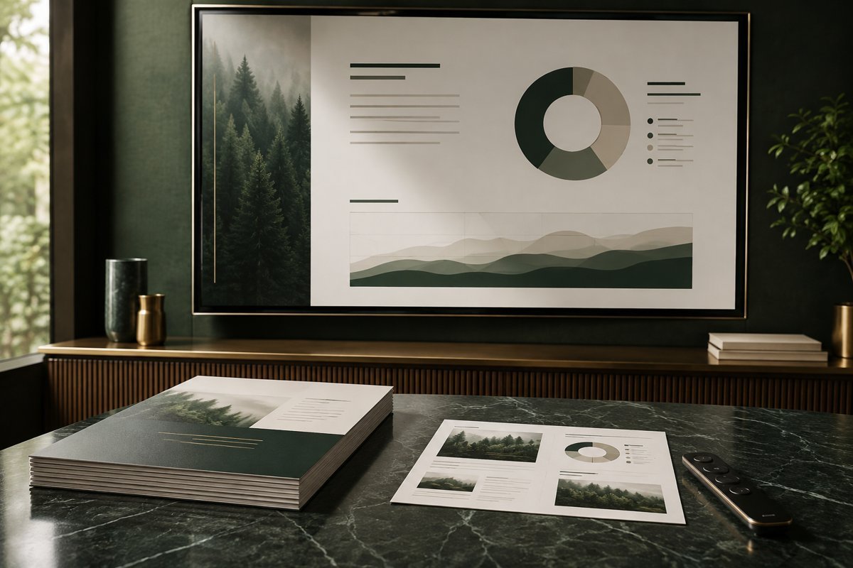
HOW I CAN HELP
Make the next conversation easier.
Presentation design
Charts and information hierarchy
THE APPROACH
From the brief to a clear direction.
Yes. I can help organise the narrative, simplify the message and design the slides so your audience can follow the offer or argument.
Your audience, purpose, source content and preferred presentation format.
THE APPLICATION
Built around the way you work.
Yes. I can work on company profiles, sales presentations and pitch decks. You provide accurate business information and supporting figures for the presentation.
Discuss your briefMost weak presentations fail before the design stage: the argument is unclear, the order is wrong, or there is too much on each slide. This page explains how I shape the story first and then design around it, for sales decks, pitch decks and company profiles, and what I need from you to do it well.
The deck is a tool for a specific conversation
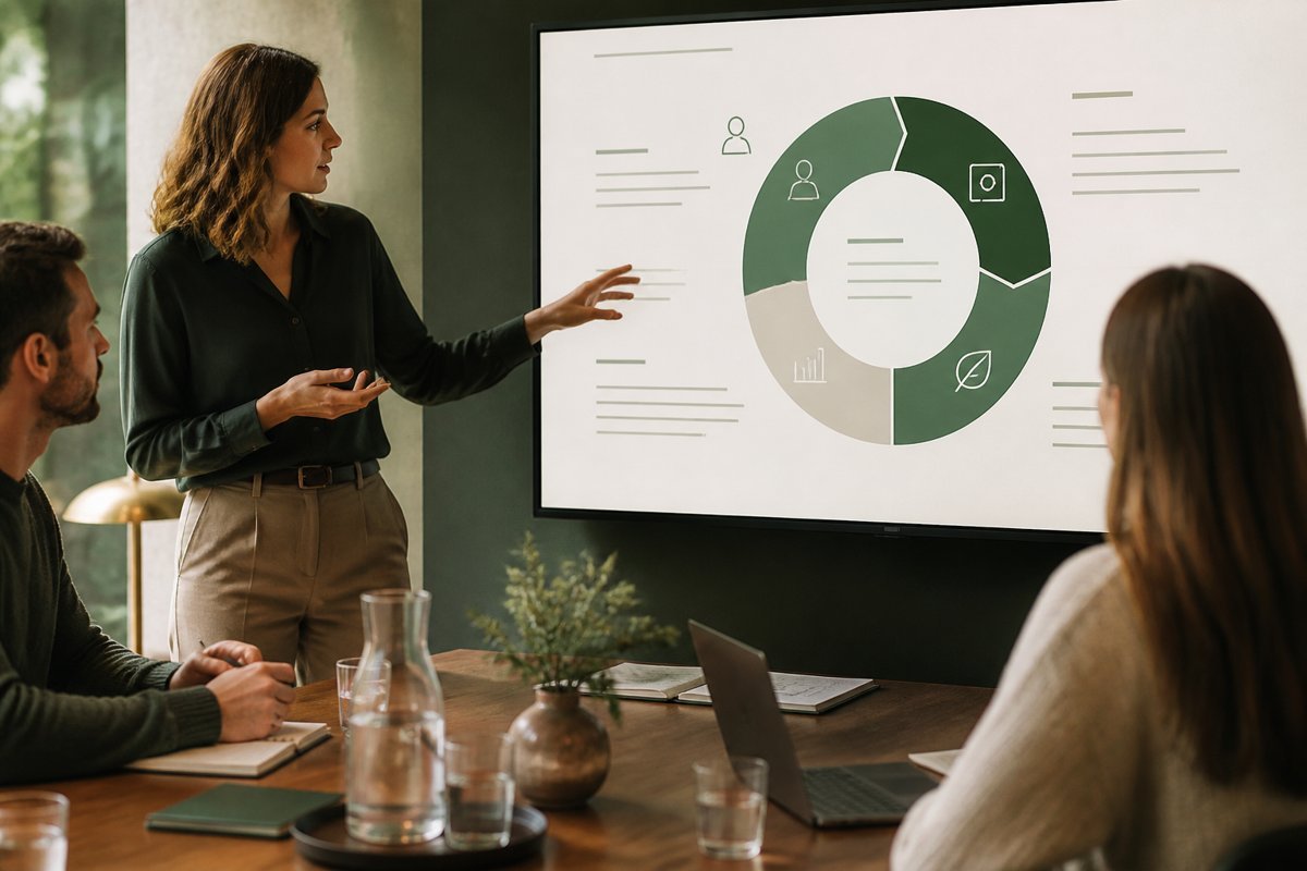
A presentation is used in a particular setting: a live meeting where you talk through it, a document someone reads alone, a screen share on a call, or a printed leave-behind. Each demands a different design. A deck you present should carry few words and let you do the explaining. A deck that is emailed and read alone must make sense without you, which means fuller sentences and clearer labels.
Many businesses try to make one file do both jobs and end up with something dense that is awkward to present and boring to read. I usually recommend deciding the primary use and, if needed, producing a lighter presented version and a fuller reading version from the same story. That is more work upfront and saves a great deal of apologising in meetings.
Story before slides
I begin with the audience and the decision you want them to make. An investor, a procurement team, a prospective client and a new employee need different things from the same facts. I ask what they already believe, what they worry about, and what would make them say yes. Then I outline the argument in plain sentences, one per slide, before opening any design software.
That outline is where most of the value is. It exposes gaps, such as a claim without evidence or a section nobody cares about. It also sets the order: usually the problem or opportunity, the proposed answer, the proof, and the next step. Only after you agree the outline do I start laying out slides, because moving slides around afterwards is far easier than restructuring finished designs.
- Audience and purpose: who decides, and what they must believe afterwards.
- One-sentence-per-slide outline, reviewed and approved.
- Content gaps listed: what proof, numbers or visuals are missing.
- Design of the master layouts, then the slides themselves.
- Presenter notes or a reading version where the use requires it.
What good slide design actually involves
Design here is mostly about hierarchy and restraint. Each slide should have one main point that the eye finds first, supported by something that makes it concrete, such as a chart, an image or a short list. I set consistent spacing, type sizes and colours through master layouts so every slide feels related and your team can add pages without breaking the look.
Charts get particular attention. A chart should answer a question at a glance, with a title that states the finding, clean labels and no decoration that distracts from the data. I design from the numbers you provide and do not alter or invent figures. If a figure looks inconsistent with another slide, I will point it out and ask you to confirm, because mismatched numbers are the fastest way to lose a sceptical audience.
Animation and transitions are kept minimal. A simple build that reveals a point as you speak can help, but decorative movement slows the room and often breaks when the file is opened in a different program. I also embed or supply the fonts so the deck looks the same on every machine.
Pitch decks, sales decks and company profiles are different things
A pitch deck for fundraising is built around a case for growth: the problem, the product, the market, the model, the team and the ask. A sales deck is built around the customer's situation and how you solve it, with proof from comparable clients. A company profile is a reference document for people who already show interest and want to check credibility: who you are, what you do, who you serve and how to engage.
I keep these formats apart. Mixing the investor story into a sales deck, or the product tour into a profile, weakens each one. If you need several, we can share a visual system and a library of approved slides, then assemble the right version for each audience, which also reduces last-minute scrambles before meetings.
Common mistakes
Too much text is the obvious one. If people read the slide, they stop listening to you. The less obvious ones are more damaging: opening with the company history when the audience cares about their own problem, burying the key point on slide twenty, and ending on a generic thank-you instead of a clear next step. Another is using stock icons and generic photos that say nothing specific.
I also see decks that make claims without support, or that show unreadable screenshots. Crop screenshots to what matters. Another problem is inconsistency from several authors pasting slides together, which leaves mismatched fonts and spacing. Finally, failing to rehearse with the real file. Test on the room's screen or your video call setup, because fonts and animations can behave differently on another machine.
What I need from you
The audience and context, the goal of the meeting, and your source content in whatever state it exists: an old deck, a website, notes, a proposal. Provide the logo and brand colours, and tell me your preferred software, whether PowerPoint, Keynote or Google Slides, because editable files in your own tool matter when you must change them later.
Supply the figures, case examples and testimonials you are entitled to use, and confirm they are accurate. I design and structure; I do not verify business claims or create evidence. If there are confidentiality limits on customer names or financials, tell me early so the design does not rely on material you cannot show.
How to judge a presentation
Success is observable in the room and afterwards. Do people follow the argument without interrupting to ask what a slide means? Can you finish in the allotted time? Do you reach the question you wanted to discuss? After the meeting, does the audience restate your case accurately to colleagues? These are better tests than whether the slides look impressive.
A good deck also becomes an asset the rest of the business uses. It should align with your Brand strategy and positioning and the visual look from Logo and visual identity, and its charts and key messages can feed Marketing creatives. For product demonstrations, a short clip from Video production can sit inside the deck instead of lengthy explanation.
Keep a short log of every meeting where the deck is used: what questions came up, which slides drew blank looks, which ones people photographed. That feedback is more useful than any design opinion, and I am happy to revise the file after a few real outings.
If the slide needs a paragraph to explain it, the slide is doing the wrong job.
When this is not the right move
If you have a meeting next week and no clear story, a designer cannot save it. The better spend is a conversation to sort out the argument, and a plain, tidy deck made from a good template. Design polish applied to unclear thinking just makes the confusion more attractive.
If you only present rarely and your needs are simple, a clean built-in template with a better structure may be all you need. I am most useful when presentations are central to winning business or funding, and when you want a reusable system that a team can maintain.
WAYS TO WORK TOGETHER
A focused project. Or ongoing support.
Start with a strategy session. We can then agree a project brief, a focused consultation or an ongoing engagement around your priorities.
YOUR QUESTIONS, ANSWERED
Presentations & pitch decks FAQs
Scope, preparation and what happens next.
Can you improve the story as well as the slides?
Yes. I can help organise the narrative, simplify the message and design the slides so your audience can follow the offer or argument.
Do you design company profiles and pitch decks?
Yes. I can work on company profiles, sales presentations and pitch decks. You provide accurate business information and supporting figures for the presentation.
What should I prepare for our first conversation?
Your audience, purpose, source content and preferred presentation format.
How are the scope and timeline agreed?
I review your requirements, starting material and target date before proposing milestones. For presentations & pitch decks, the schedule depends on complexity, review rounds and the access or assets needed.
How much does this service cost?
Start with a strategy session at ₹2,999 + GST. A digital audit starts from ₹19,999 + GST, and ongoing monthly options start at ₹50,000 + GST for SEO consulting or ₹75,000 + GST for a consulting retainer. Project delivery is scoped and quoted separately; we can choose the right arrangement for your brief.